The psychology of colour in office design
| The psychology of colour in office design_approved | 36.5 KB | Download | |
| ATC fit-out by Trend Group | 1.54 MB | Download | |
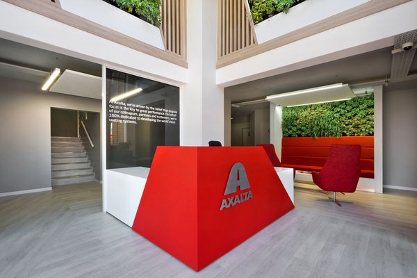 Preview Preview | Axalta fit-out by Trend Group | 1.66 MB | Download |
 Preview Preview | Bitco fit-out by Trend Group | 1.38 MB | Download |
 Preview Preview | DNA fit-out by Trend Group 01 | 1.93 MB | Download |
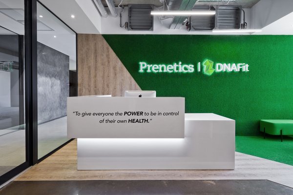 Preview Preview | DNA fit-out by Trend Group 02 | 2.32 MB | Download |
 Preview Preview | Mitsui fit-out by Trend Group | 2.01 MB | Download |
 Preview Preview | Oracle fit-out by Trend Group | 2.01 MB | Download |
| Oracle fit-out by Trend Group 01 | 11.59 MB | Download | |
 Preview Preview | Oracle fit-out by Trend Group 02 | 1.92 MB | Download |
 Preview Preview | Oracle fit-out by Trend Group 03 | 2.01 MB | Download |
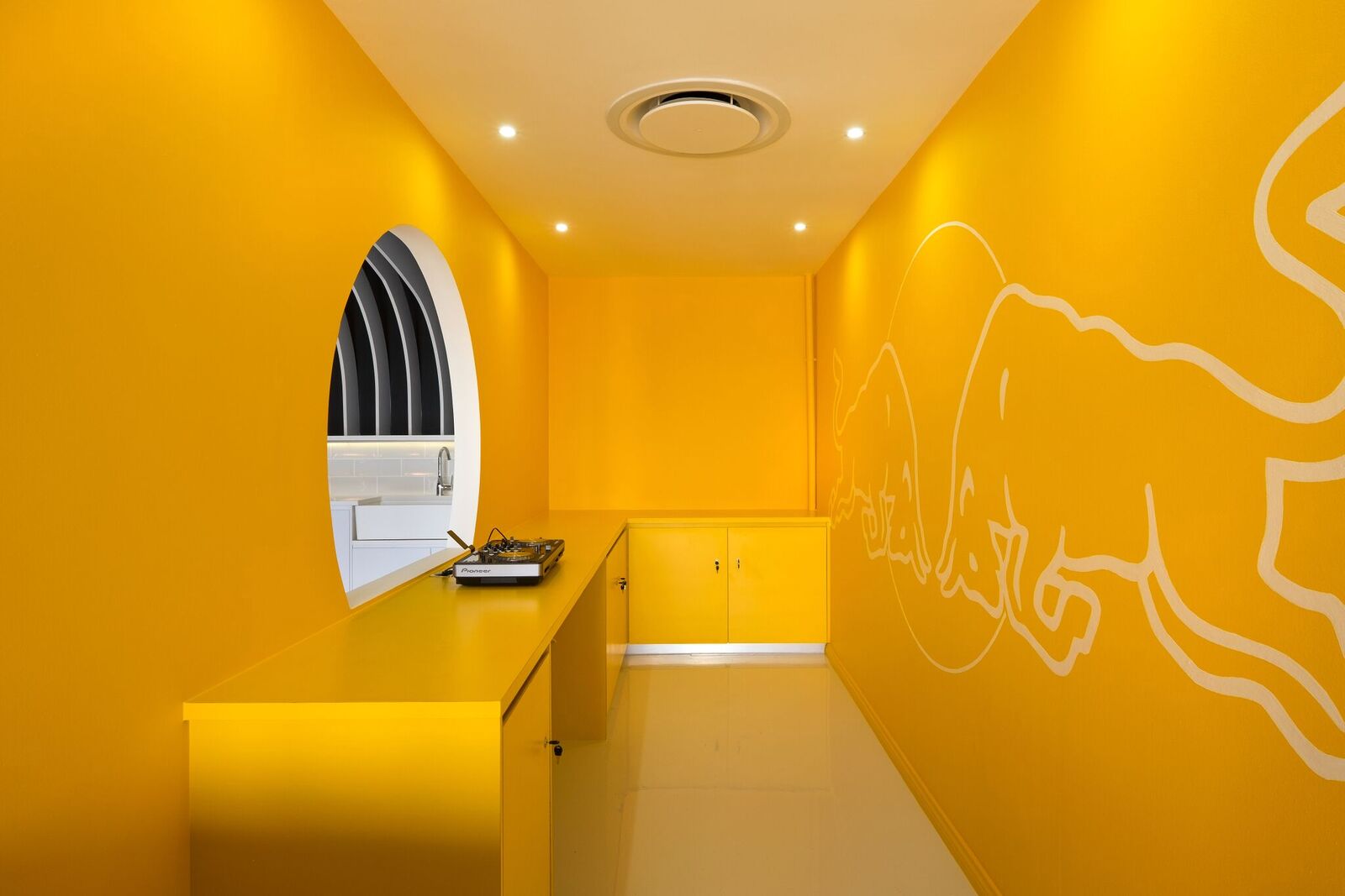
 Preview Preview | Red Bull fit-out by Trend Group | 95.35 KB | Download |
 Preview Preview | Silica building fit-out by Trend Group 01 | 205.23 KB | Download |
 Preview Preview | Silica building fit-out by Trend Group 02 | 2.01 MB | Download |
 Preview Preview | UBER fit-out by Trend Group 01 | 1.58 MB | Download |
 Preview Preview | UBER fit-out by Trend Group 02 | 2.15 MB | Download |
Deciding upon a colour scheme for a workspace design requires careful planning and client consultation, as it is critical to create a stimulating and productive environment for employees. The careful use of colours not only stimulates productivity, but also affects the mood, attitudes, and emotions of workers.
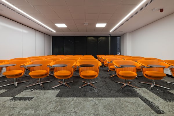
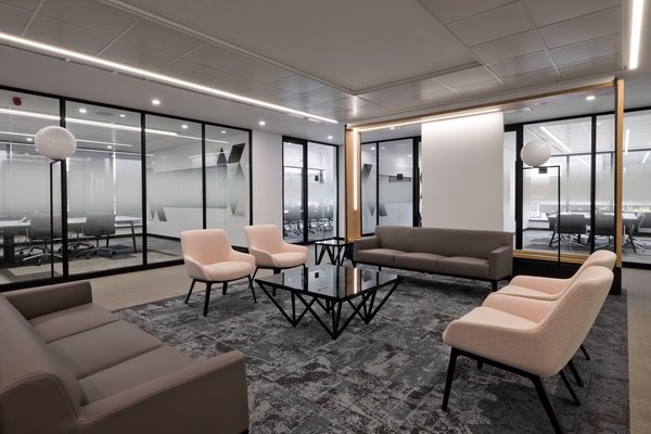
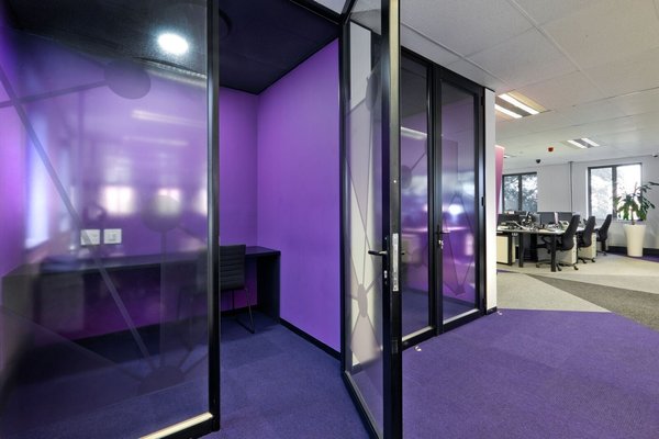
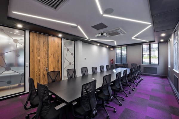
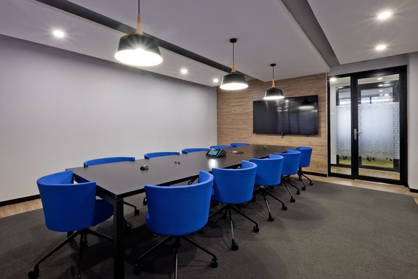
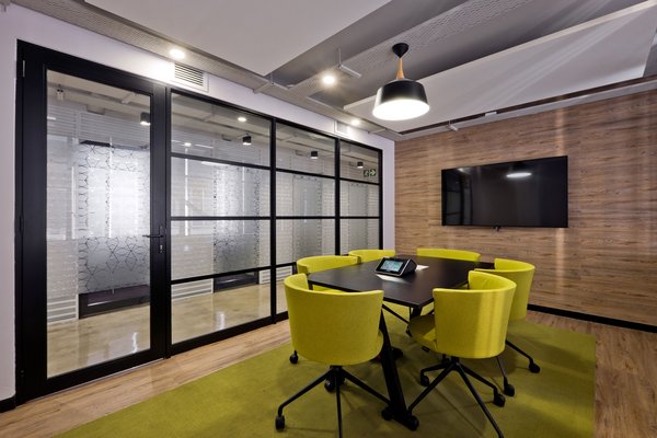
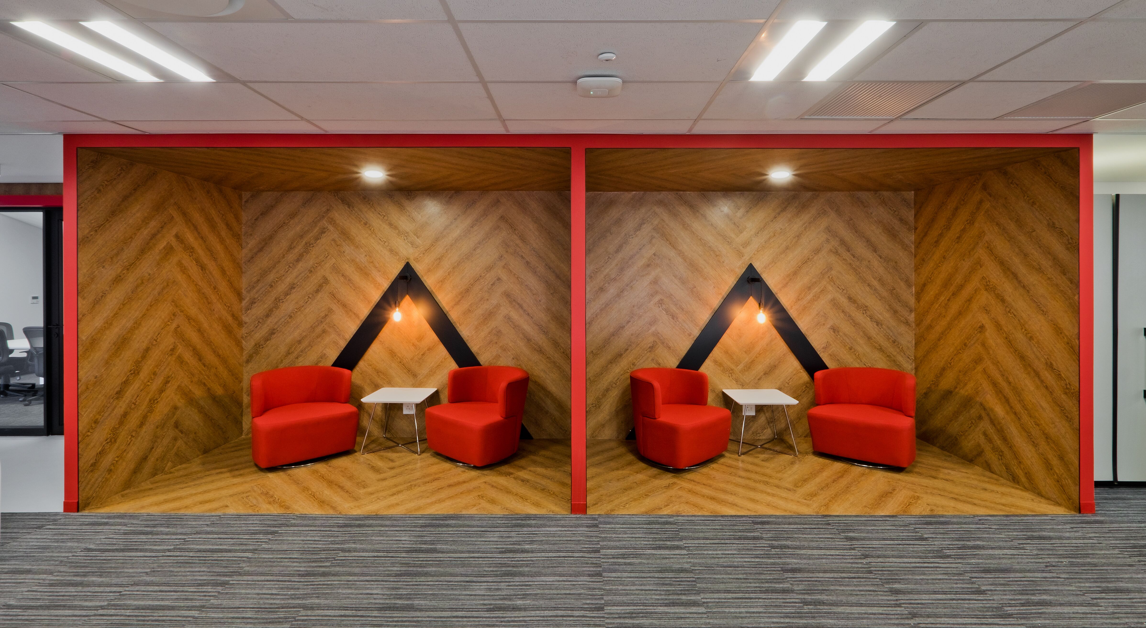
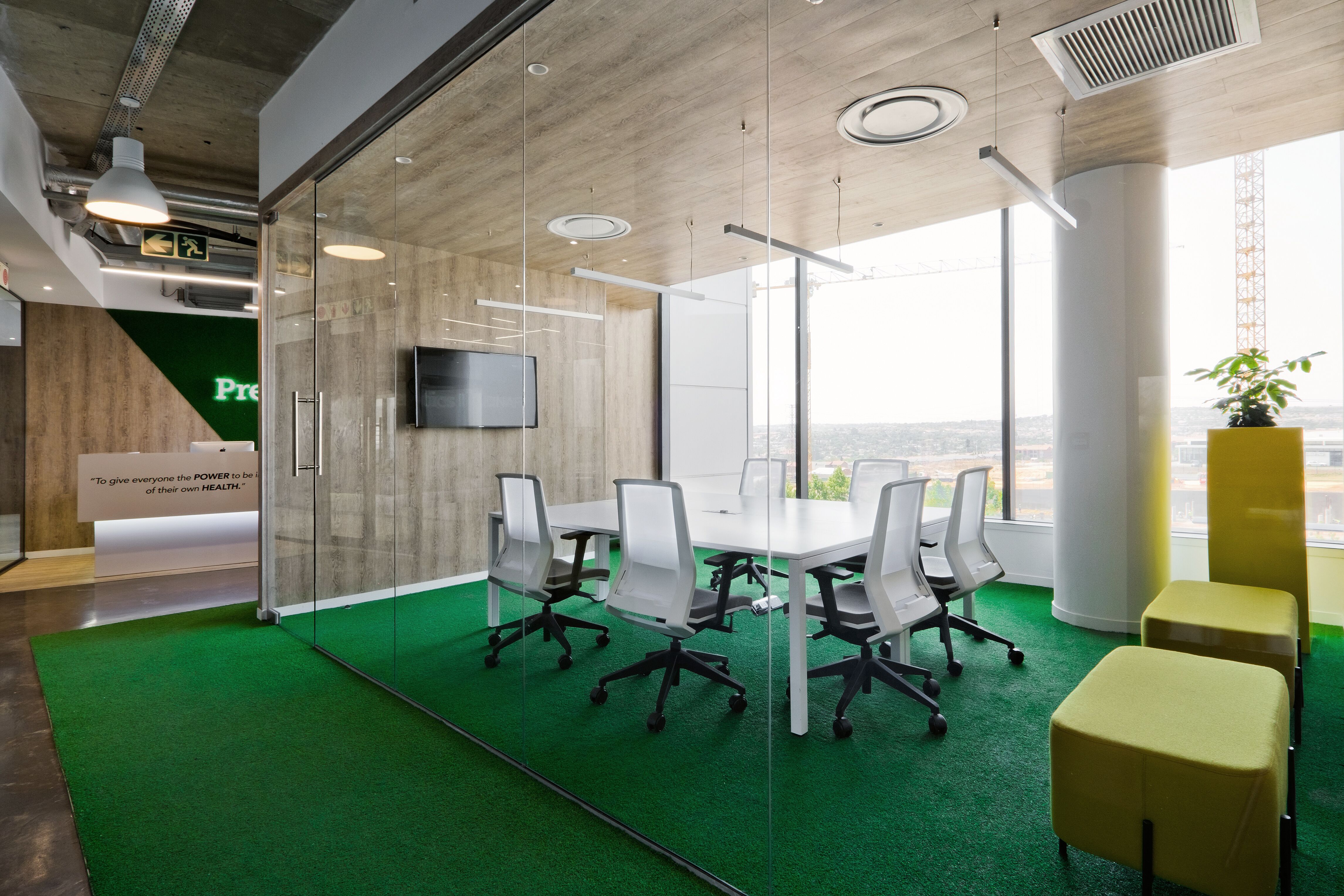
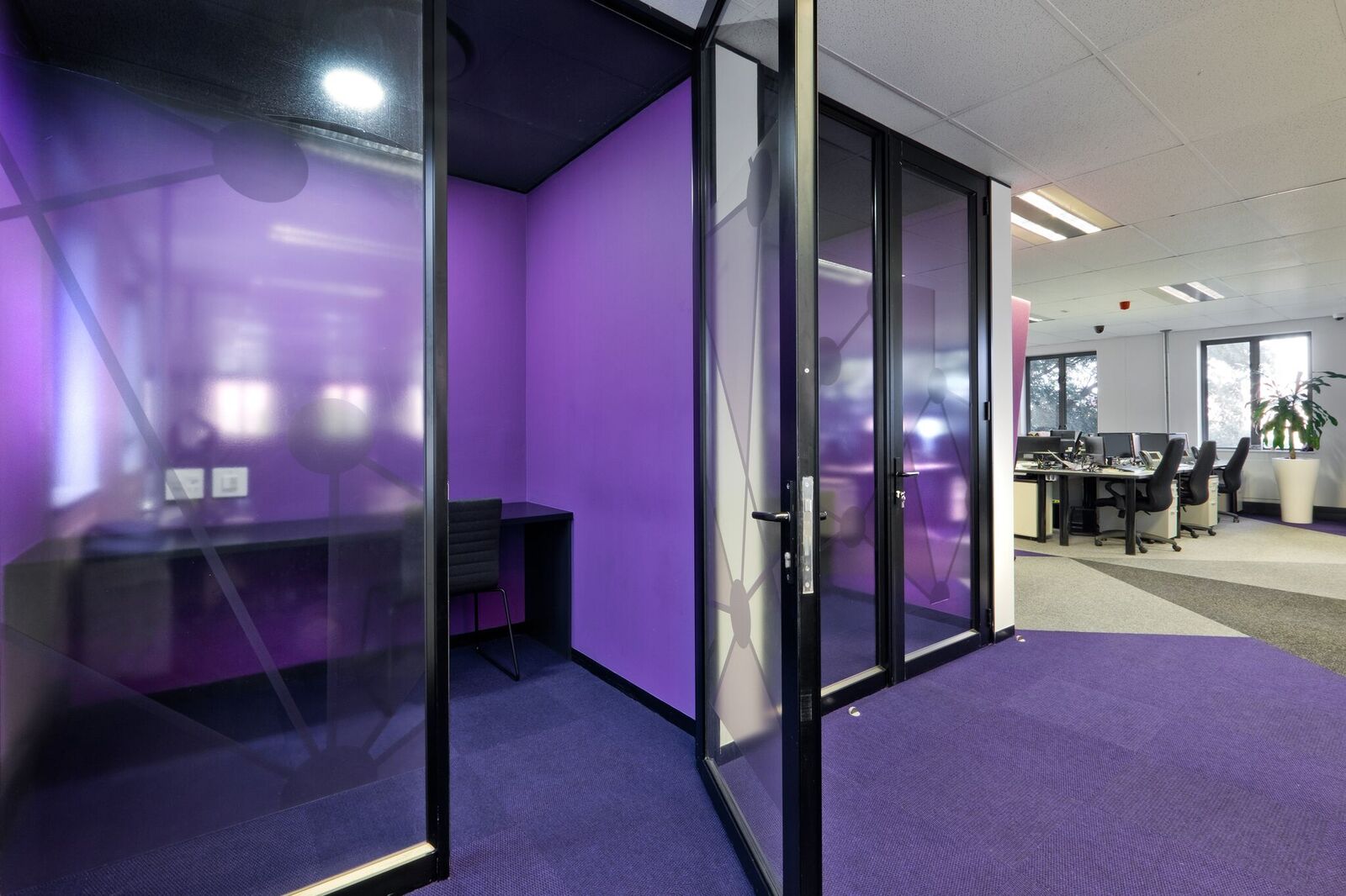
Hence when designing a workspace, it is important to strike a balance between keeping employees stimulated and motivated, as well as relaxed and calm. Trend Group Senior Interior Designer Jean Swanepoel points to the science of colour selection, which reveals that brighter colours such as red and orange encourage dynamism and employee engagement, raising the energy level in a workspace, while cool colours such as blues and greens encourage relaxation and calmness.
Colour selection has evolved from the traditional neutral office look of typically navy blue and wood veneer to reflect the values of loyalty and solidity. Many companies now strive to create workplaces that not only reflect their brand, but that truly embody that brand and its values. In essence, the workplace becomes a strategic branding tool. While there is a lot more to it than just positioning logos and selecting brand colours, colour does have a major role to play.
“Nowadays workspaces have to be attractive and generate a level of excitement and purpose, which plays a vital role in companies being able to retain valuable talent and skills,” Swanepoel highlights. She points to the interior fit-out for WeWork at The Link in Rosebank, where Trend Group opted for a neutral colour palette with a lot of patterning to individualise the space.
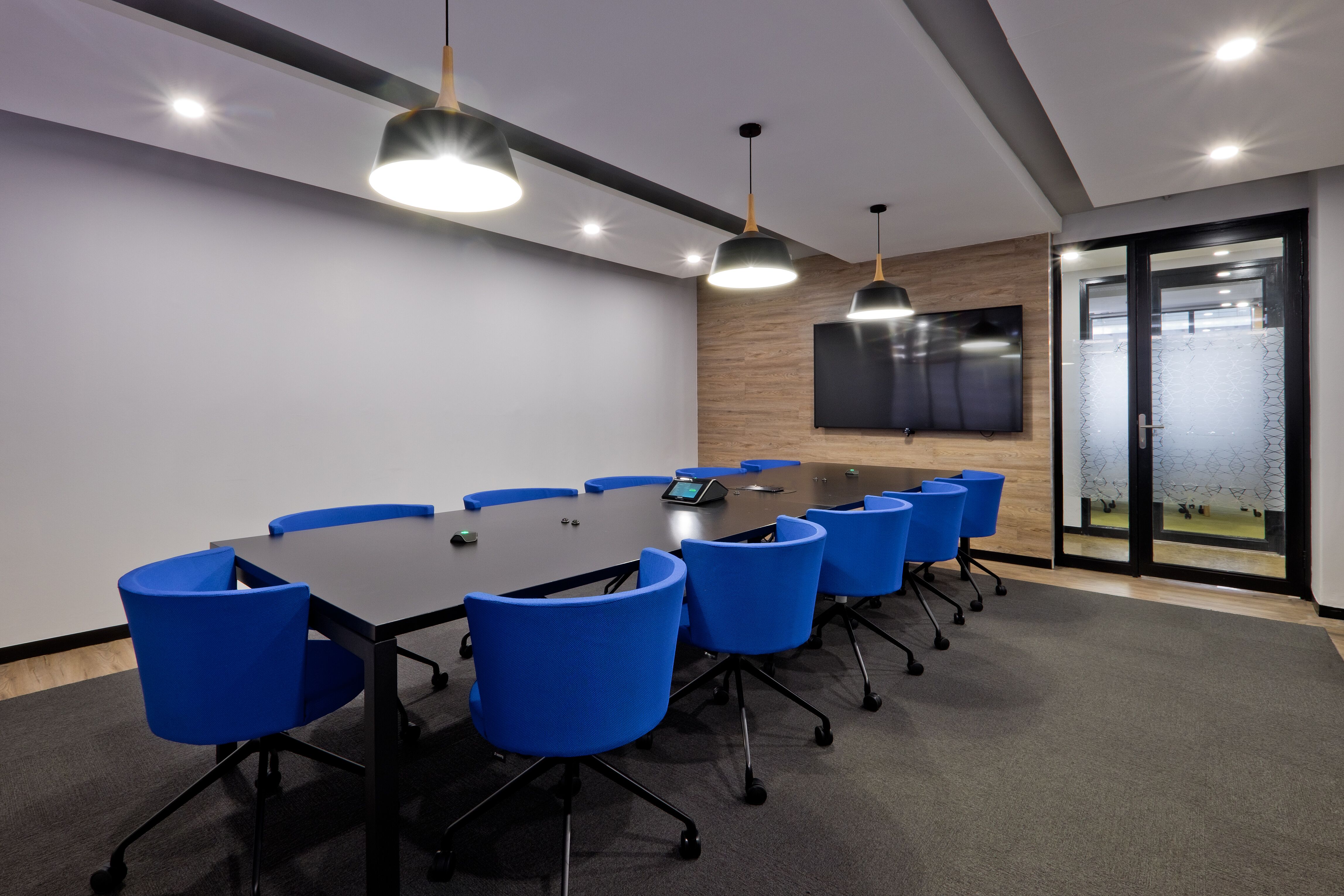
“Gone are the days when a wall is painted blue, and that then becomes the prevailing colour. Now interior designers are becoming far more creative, not only in using pops or splashes of different accent colours, but to enhance colour selection by means of office furniture, ceilings, flooring and carpeting, and also surfaces and textures,” Swanepoel notes.
“I personally love using yellow, but if you overdo it, it can result in anxiety among workers, as it is such an energetic colour. Hence blues and greens are ideal to promote worker stability in the actual work environment, as well as meeting and focus rooms or collaboration areas. These softer colours are ideal here. On the other hand, brighter colours can be incorporated in breakaway environments where you do not need to concentrate that much, such as canteen spaces,” Swanepoel elaborates.
Working with a specific client on colour selection not only requires adhering to specific corporate identity guidelines, but exactly how these colours are to be incorporated in the overall design. “How do you use it in the brand? This is very important. You have to ensure that the majority of your colour scheme links to the corporate branding, in order to create a sense of identity for staff and to convey its values and culture,” Swanepoel adds.
Therefore, before deciding on the final colour scheme, it is important to understand the organisation’s culture. A workspace’s design and colour scheme is paramount in creating an appropriate ambience in light of the company culture, and can also tell a story. Not only is implementing the correct colour scheme vital for employee productivity, but also to impress clients and visitors.
An office’s colour is the first thing you notice on arrival, and the last thing you take away with you, and hence has a substantial subconscious effect. The choice of colour therefore could have a considerable effect on your company’s success.
In addition to using corporate colours, how to pair this with complementary colours is an equally important skill, and one that has seen Trend Group work successfully with some of the best-known global brands, from Uber to WeWork and Oracle. “Clients are confident in our expertise, and hence are more open to our suggestions as well, as long as there is merit in our choices. Of course, everybody has their likes and dislikes when it comes to colours, so it is vital for us to workshop our designs with both the client and their staff so as to ensure we have the buy-in of everyone involved.”
In terms of the latest trends, Swanepoel reveals that the 2020 international colour palette will move away from pink, orange, and coral towards blue and green pastels, and even dark emerald, for a more mature and natural look-and-feel. The emphasis on cleaner and softer pastel colours reflects the current trend in interior design towards smooth, rounded, or geometric shapes and objects.
Major corporates that occupy multi-storey buildings also use their colour palette to differentiate each floor, as well as providing a unifying theme. The crucial thing to remember here is that figuring out how to create a colour palette that’s perfect for your brand takes time, focus, and creativity. There are no concrete rules for choosing the right brand colours, and there’s always a chance that you’ll get better results by colouring outside of the lines and going against the rules of colour theory. Hence it is best to work alongside a team of design and branding experts that are ready to guide you and work with you on a colour palette that works for your business.
Ends
About Trend Group
Trend Group specialises in interior design and refurbishments in the commercial, industrial and retail sectors. We are a comprehensive, solutions-driven company that operates on a turnkey basis. We offer a streamlined approach to design, procurement, and construction delivery, covering all aspects of the project solution. We are a proud Level 3 B-BBEE accredited company.
Trend Group Contact
Gavin Dickinson
Business Development Director
Email: gavin [at] trendgroup [dot] co [dot] za
Web: www.trendgroup.co.za
Media Contact
Renay Tandy
NGAGE Public Relations
Phone: (011) 867-7763
Fax: 086 512 3352
Cell: 082 562 5088
Email: renay [at] ngage [dot] co [dot] za
Web: www.ngage.co.za
Browse the NGAGE Media Zone for more client press releases and photographs at http://media.ngage.co.za